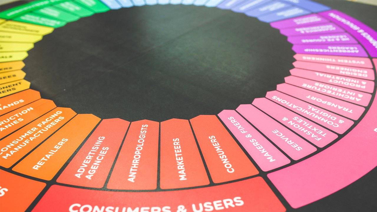
How to select the right colors for your website

Selecting colors for a website is not a random process, but it depends on various factors, aiming to increase the conversion rate. Many users buy products using eshops with attracting colors. That's why we want to show you how to select the right colors for your website.
Colors can make a difference.
Get the most out of it!
Our web designers confirm that the safest way to highlight a business's genre and identity is by using the right color palette.
Red, orange, black and blue royal are used by companies that target more affluent customers, while pink, blue and magenta attract everyday audience and are mainly used by fashion-related companies.
Colors and cultural differences
The process to select the correct colors for your website starts by identifying your target market. In particular, when you address an audience of different ethnic backgrounds, colors vary from region to region and from culture to culture. Therefore, you have to take your target group's nationality under serious consideration For instance, in western cultures, white represents purity and peace, while in China white is a symbol of death and mourning.
Make users feel at home
To increase the amount of time a user spends on your website, you need to make them feel familiar. To achieve this, choose colors that are directly or indirectly linked to your products. For instance, for an eshop promoting honey, it's smart to design it in gold and white. Gold can be associated in the mind of the user with honey and white creates a modern contrast with gold, resulting in a sense of luxury.
The psychology of colors
Colors can stimulate intense feelings. Some colors make a positive impression, while others bring negative experiences to our memories. Color psychology is a key chapter in marketing.
Red
Red has various meanings in western cultures. It may give a warning to stop someone, but it is also linked to love and even Christmas. In general, it is used to indicate an emergency situation, which is why it causes tension to users. Famous food companies have used it, as it acutes the sense of hunger. In any case, it is a color that results in a good conversion rate.
Yellow
Yellow captures the attention of the user. It is not often found in nature, that's why it attracts the human eye. Yellow creates feelings of happiness and optimism. It is very often used as a stimulus for creativity and makes people feel good with themselves or their purchase. Yellow will make your buying audience feel comfort with their purchase.
Green
Green reminds us of nature. It is the ideal choice if you want to promote activities that take place close to nature, such as camping or hiking. At the same time, green is the right color to design environment-related websites. If you think red or orange is not the ideal option for call-to-action buttons, green is a good alternative.
Blue
Blue is one of the most common colors chosen to build a website, because it inspires confidence, honesty, and security. The advantage of blue is that you can use it extensively, without visually wearing down the user. By selecting different shades of blue, you can create a smooth result.
Orange
Orange can carry various messages. Some see it as synonymous to warmth and optimism. Others translate it as a potential risk and consider it to be aggressive. Orange is definitely the latest trend in e-commerce. It appears in most call-to-action buttons. There are many who think that orange environments maximize the conversion rate of a website.
White
In western cultures, white symbolizes clarity, purity, translucence, and honesty. It perfectly matches with blue and gold, and it's the perfect color to use for the background of your site. Avoid using it in call-to-action buttons, as experts claim it's not right to increase interaction with your customers.
Black
Black on a website is a symbol of strength and authority, so it is often used in high value products or special editions. It reaches male audience more effectively and is widely used in technology or fitness products. Nonetheless, black does not fit every business environment and all products. For instance, black is not suitable for a health or cosmetology website, as such environments are places where the audience wants to feel safe and serene, and these needs are obviously not covered by black.
Conclusion
Choosing the right colors for your website is not such a difficult decision. Taking into account your company's profile and target market, you can easily end up with the color that ultimately fits your company's needs. It remains, though, a fact that a color on its own is not enough to do the trick. Developing a website requires extensive analysis, high expertise, and meticulous planning.
Last minute tips
Keep the background relaxed, without pulling attention.
Be sure of the symbolisms you want to denote with the colors.
Take into account the specific cultural characteristics of your audience.
Create visible call-to-action buttons.
Stay true to the responsive design.
Contact us for a free offer
Fill out the contact form below so that we can prepare a detailed offer based on your exclusive needs. Trust us and see your idea implemented in the best way.

